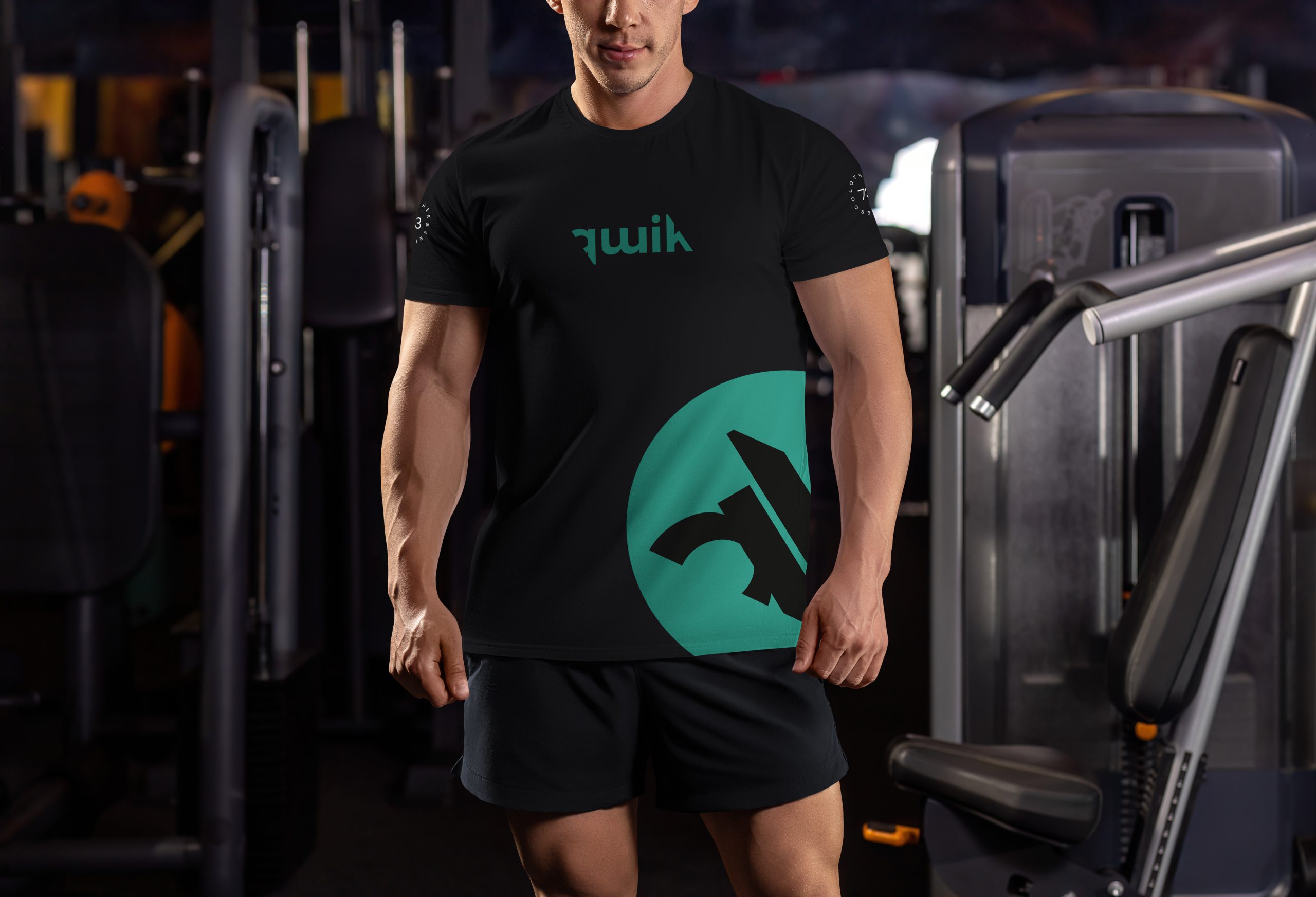
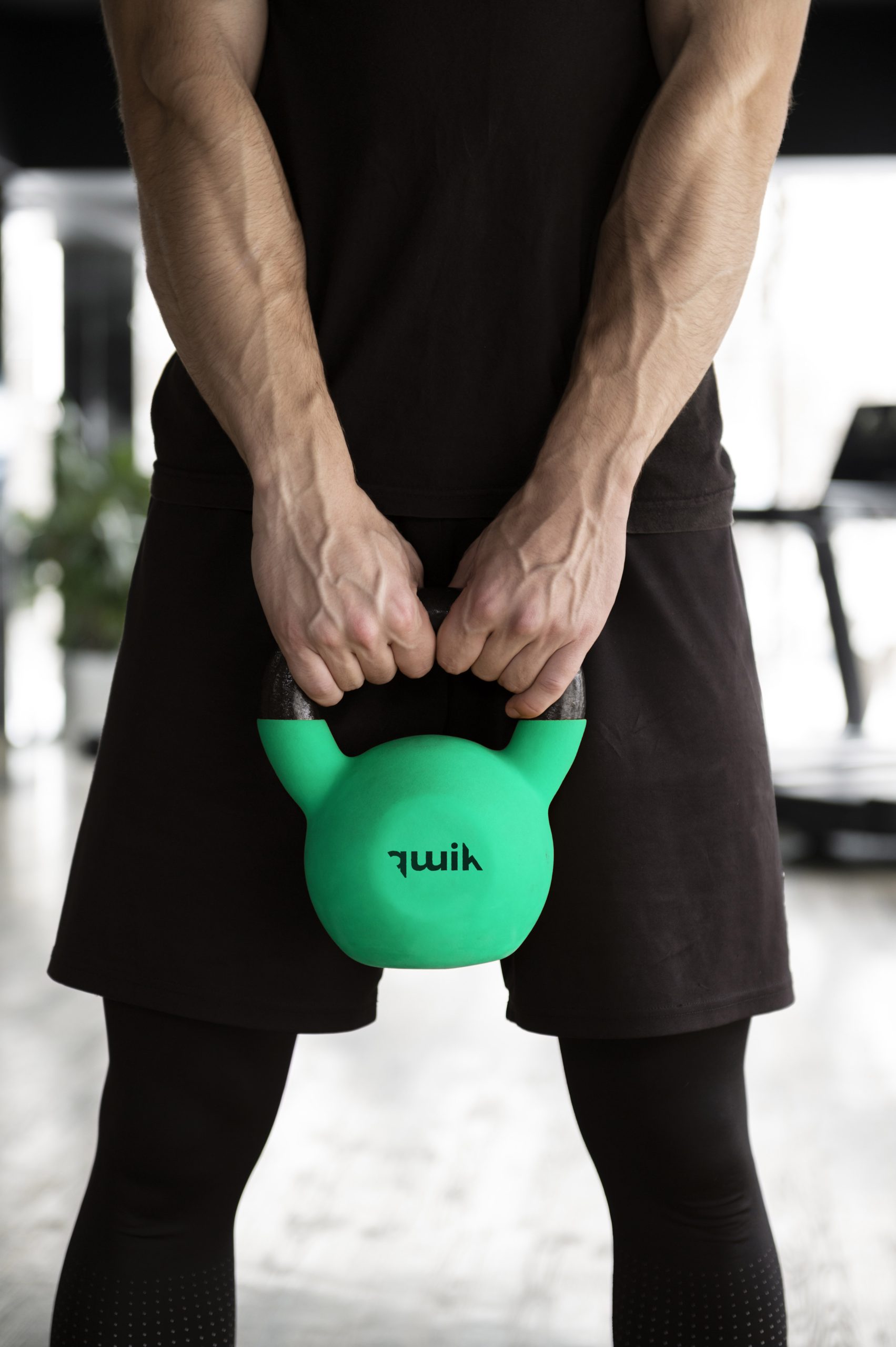
For "Qwik" fitness center, the logo and t-shirt design should reflect energy, speed, and modernity.
For the Qwik logo, the design process centered around creating a bold and impactful visual identity that aligns with the brand's energetic and modern ethos.
The first option, featuring the "Qwik" name inside a circle, was crafted to evoke a sense of unity and focus, with the circle symbolizing inclusivity and the idea of completing a fitness journey. The bold typography reinforces strength and confidence, making the logo both eye-catching and memorable.
The second option presents the "Qwik" name without the circle, offering a more streamlined and versatile design. This version highlights the brand's direct and straightforward approach to fitness, ensuring the logo is adaptable across various mediums while still maintaining a strong visual presence.